Azalea's Market
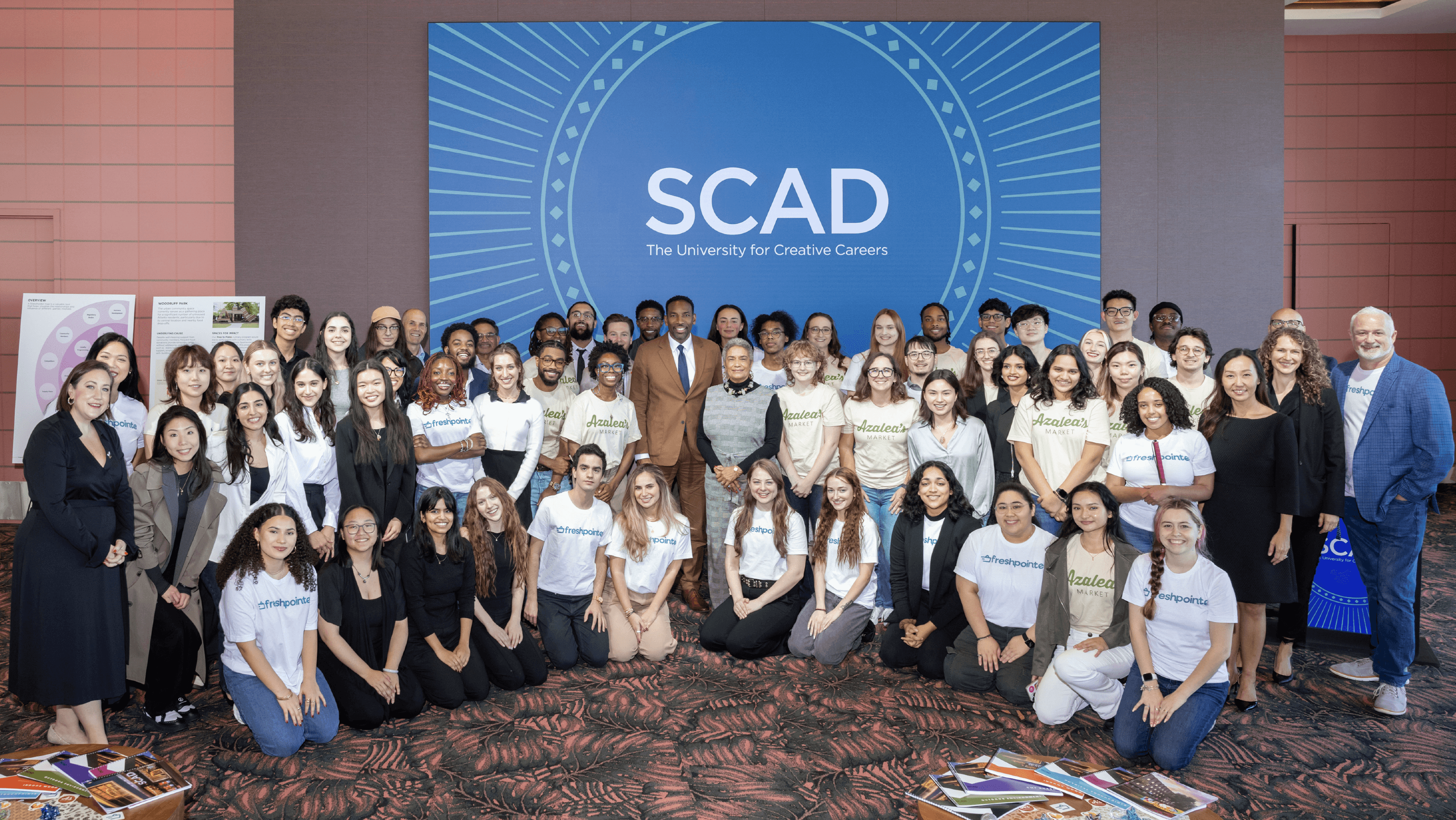
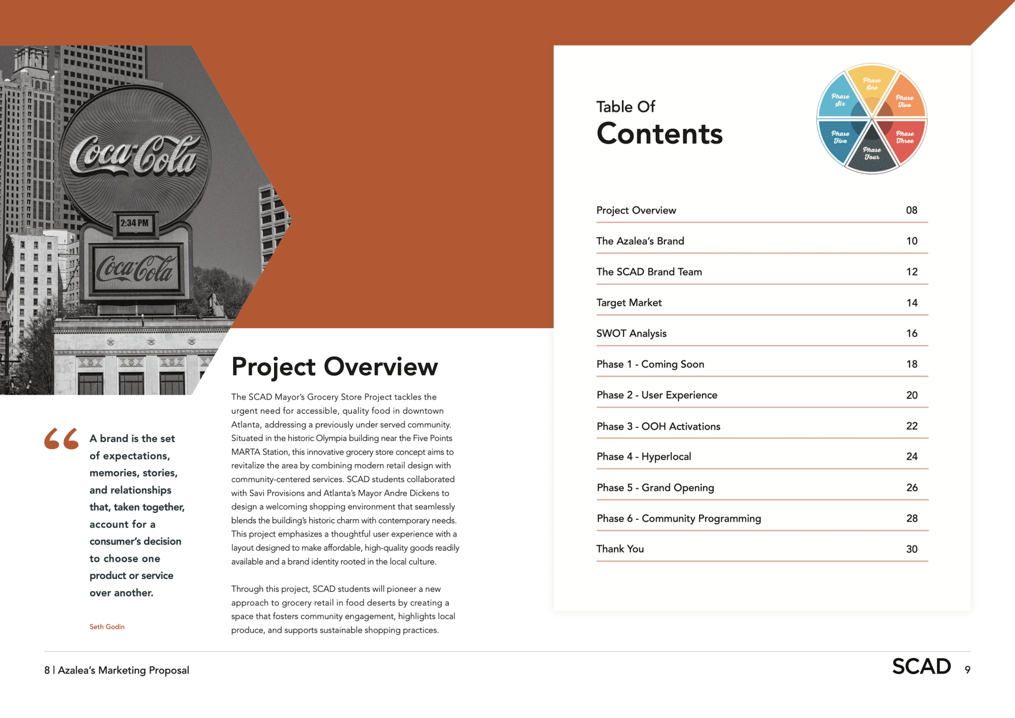
Azalea’s Market is a community-focused grocery concept developed to serve downtown Atlanta residents affected by a food desert. As Senior Brand Strategist, I led research and strategy for a SCAD team, partnering with the City of Atlanta, Savi Provisions, and IGA to create a sub-brand rooted in local values. I helped guide cross-functional collaboration and presented the final concept to Mayor Andre Dickens, Savi and IGA leadership, and senior SCAD executives. The result is a brand designed to promote access, equity, and community wellness through a fresh and affordable shopping experience.
CLient
The City of Atlanta & Savi Provisions
Role
Senior Brand Strategist
2024
Year
Azalea's Market
Azalea’s Market is a community-focused grocery concept developed to serve downtown Atlanta residents affected by a food desert. As Senior Brand Strategist, I led research and strategy for a SCAD team, partnering with the City of Atlanta, Savi Provisions, and IGA to create a sub-brand rooted in local values. I helped guide cross-functional collaboration and presented the final concept to Mayor Andre Dickens, Savi and IGA leadership, and senior SCAD executives. The result is a brand designed to promote access, equity, and community wellness through a fresh and affordable shopping experience.
Client
The City of Atlanta & Savi Provisions
Role
Senior Brand Strategist
2024
Year
Azalea's Market
G-Fit Refresh
Azalea’s Market is a community-focused grocery concept developed to serve downtown Atlanta residents affected by a food desert. As Senior Brand Strategist, I led research and strategy for a SCAD team, partnering with the City of Atlanta, Savi Provisions, and IGA to create a sub-brand rooted in local values. I helped guide cross-functional collaboration and presented the final concept to Mayor Andre Dickens, Savi and IGA leadership, and senior SCAD executives. The result is a brand designed to promote access, equity, and community wellness through a fresh and affordable shopping experience.
Client
Work Type
The City of Atlanta & Savi Provisions
personal Project
Role
Senior Brand Strategist
Solo Project
2024
2025
Year
What's the problem?
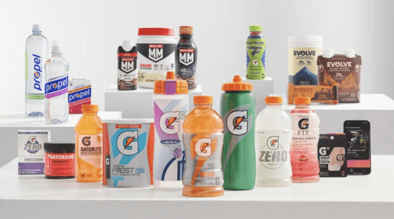
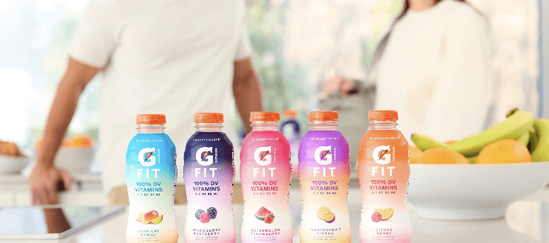
Gatorade FIT was created to compete in the wellness space, but consumers didn’t see it that way. Visually, it blended into the performance-first Gatorade lineup. Strategically, it lacked a clear identity.
While competitors like Liquid I.V. and Prime were bold, benefit-driven, and clean, Gatorade FIT felt caught between two worlds—and it was losing ground fast.
Wellness tops performance as the new standard
Gen Z and Gen Alpha crave clarity, customization, and connection.
Gatorade’s performance heritage felt disconnected from everyday health.
“Healthy” sub-brands weren’t clearly segmented or positioned.
Prime gained 8.2% market share in one year—by doing what Gatorade didn’t.
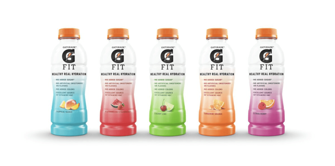


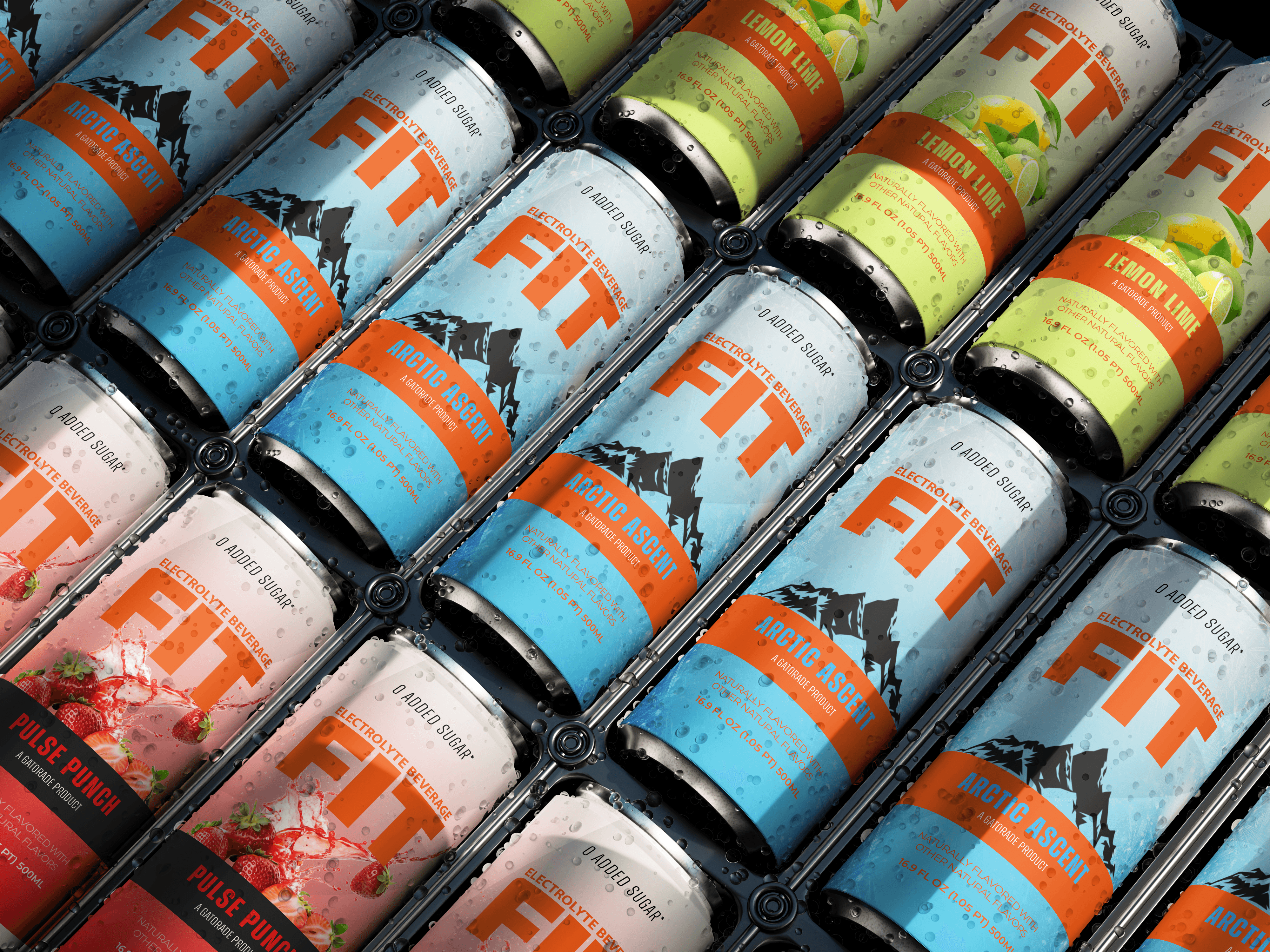
The Brand Refresh
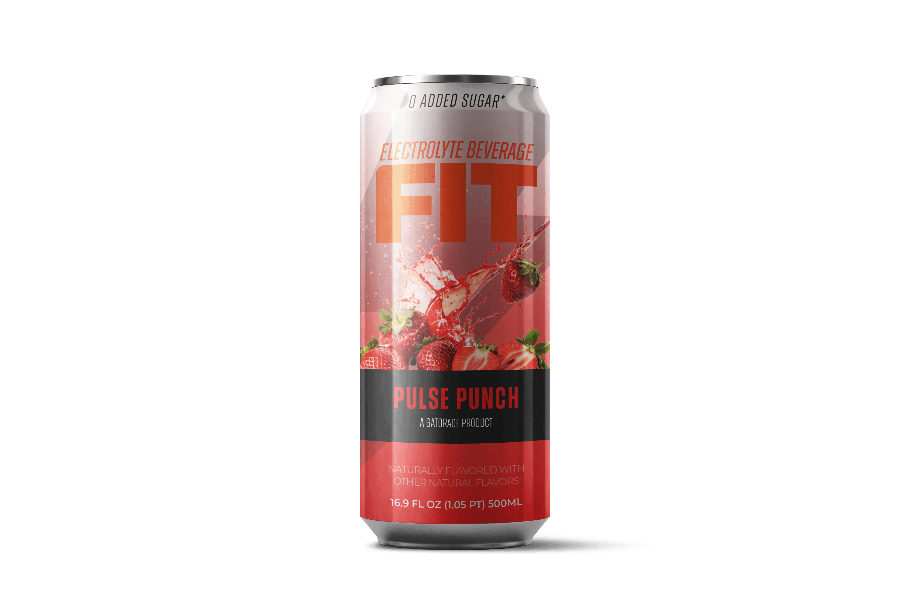
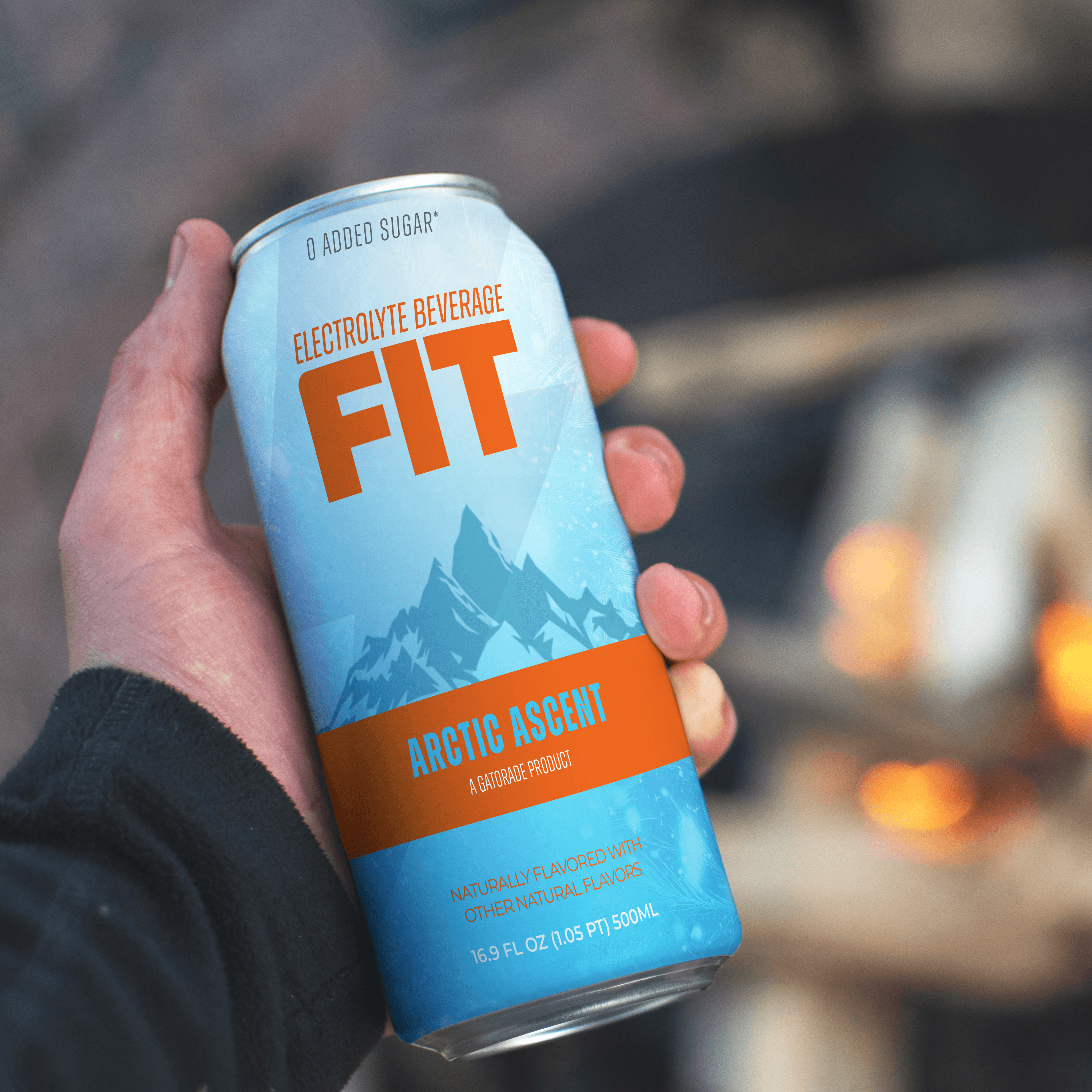
I didn’t touch the main Gatorade logo. Instead, I gave FIT its own voice - one rooted in wellness, backed by science, and fueled by modern design. This was a shift from “elite athlete” to “everyday hydration,” without losing Gatorade’s signature energy.
The Icon Refresh
Rather than redesigning the iconic Gatorade bolt, I refined its role within the FIT identity - scaling it back and letting wellness lead. This subtle shift helps distinguish FIT while preserving the brand equity of Gatorade’s most recognizable symbol.
From Performance to Wellness: A Bold New Era for Gatorade FIT
Gatorade FIT was built for wellness, but its story wasn’t being told. Our challenge was to reposition this overlooked sub-brand and reconnect it with a new generation of consumers - without losing the core energy of Gatorade.
I developed a refreshed identity and communication strategy for Gatorade FIT - designed to compete in a wellness-first market where visual clarity, authenticity, and function reign.

Brand Strategist + Designer
This was a solo project where I led end-to-end creative strategy—from market analysis and sub-brand positioning to visual refresh and execution across packaging, website, and influencer activations. I also integrated over 100+ AI-generated ideation prompts into my creative process to test messaging, visuals, and tone across multiple consumer personas.

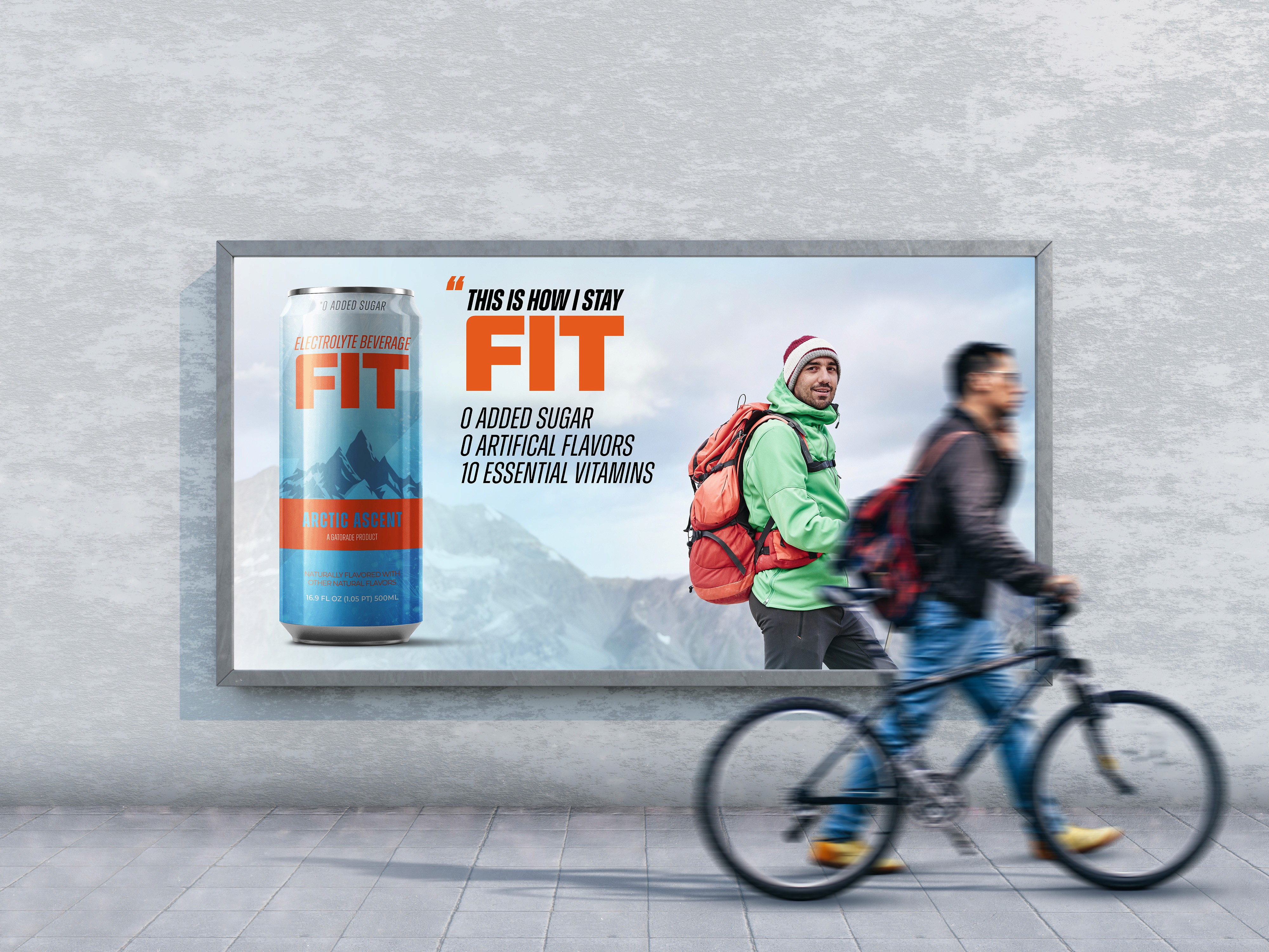
OOH Advertising
FIT’s out-of-home campaign shows up where movement matters—city streets, transit hubs, and gyms. Clean visuals and bold taglines like “This is how i stay fit.” make the product message instantly clear.
Designed for quick impact, each placement uses strong contrast and confident typography to stop people in their tracks. The result? Wellness that looks sharp, feels personal and sticks with you—long after the billboard.
~$12 Million in funding
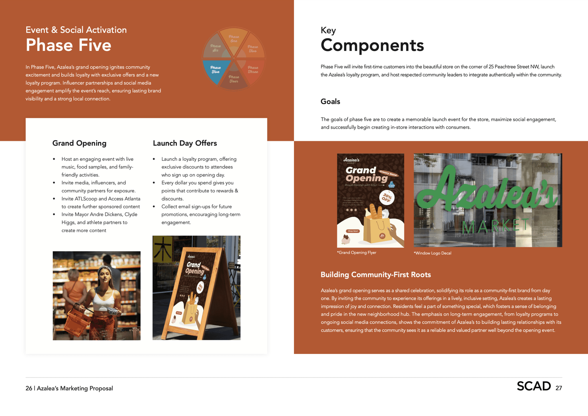
The Azalea’s brand concept was chosen by Savi Provisions CEO, Paul Nair and Atlanta Mayor, Mayor Dickens. They have since decided to open two new grocery stores under this name in 2025. One of these stores will be located in the heart of downtown Atlanta near the Five Points Marta station, while the other will be further south, near the airport.

The Brand
The Brand
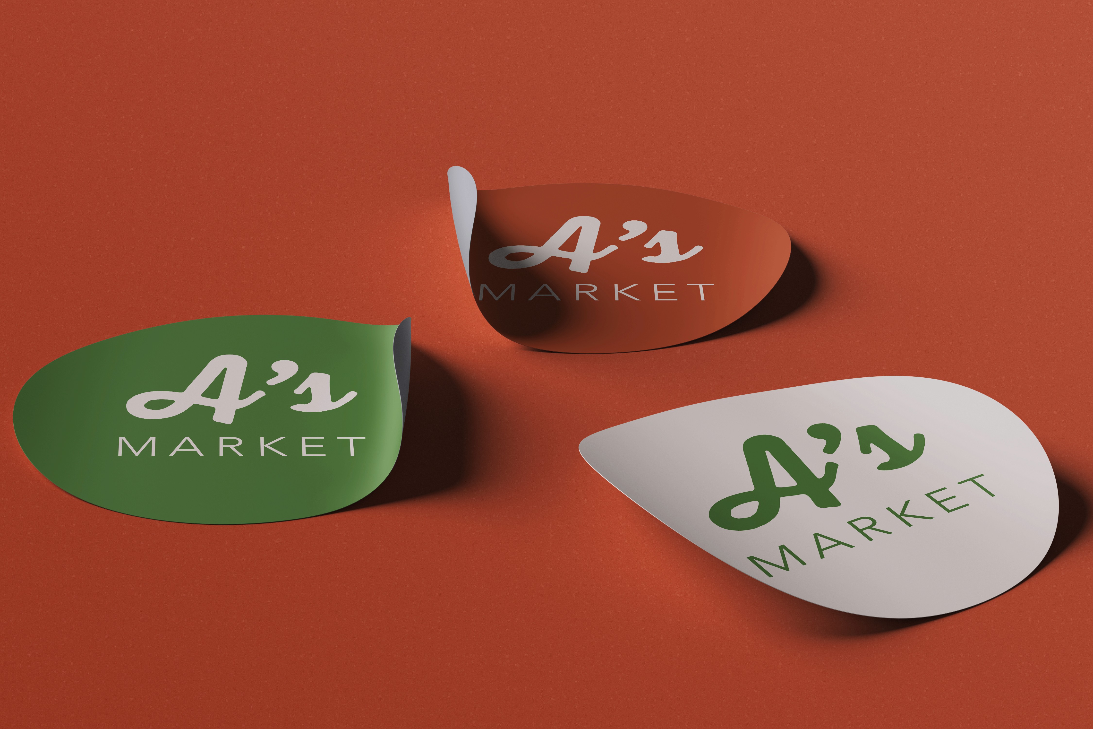
Azalea's Market
Azalea's Market
The full brand name
A's
A shorthand for Atlanta

The name Azalea’s comes from the Georgia State Wildflower. The Azalea is one of the most resilient flowers in the world, and given that this store is going into a food desert, we felt that the name represented the resilience of the people in this community (ie, the target audience).
Digital Natives

A's
A shorthand for Atlanta


The UX Perspective
The UX Perspective
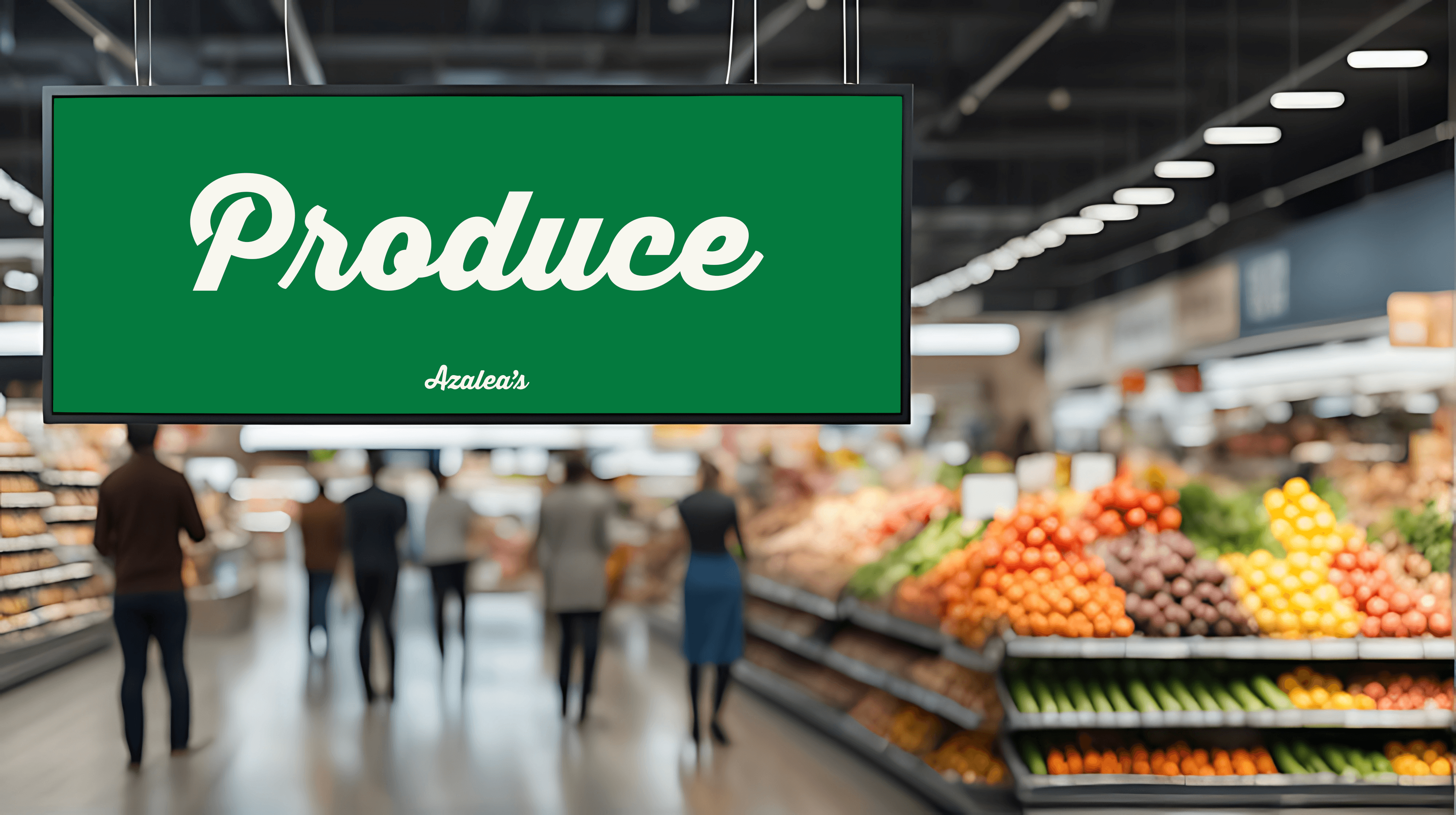
From a UX standpoint, Azalea was designed to feel like a trusted neighbor—familiar, approachable, and inspiring. By personifying the brand, we create a human-centered experience that resonates emotionally and functionally with our community. Every touchpoint—from store layout and signage to digital interfaces and delivery services—is guided by the core idea that Azalea is not just a store, but a companion in daily life. She represents progress, accessibility, and warmth, helping users feel seen, supported, and valued in their journey toward better, fresher living.
From a UX standpoint, Azalea was designed to feel like a trusted neighbor—familiar, approachable, and inspiring. By personifying the brand, we create a human-centered experience that resonates emotionally and functionally with our community. Every touchpoint—from store layout and signage to digital interfaces and delivery services—is guided by the core idea that Azalea is not just a store, but a companion in daily life. She represents progress, accessibility, and warmth, helping users feel seen, supported, and valued in their journey toward better, fresher living.

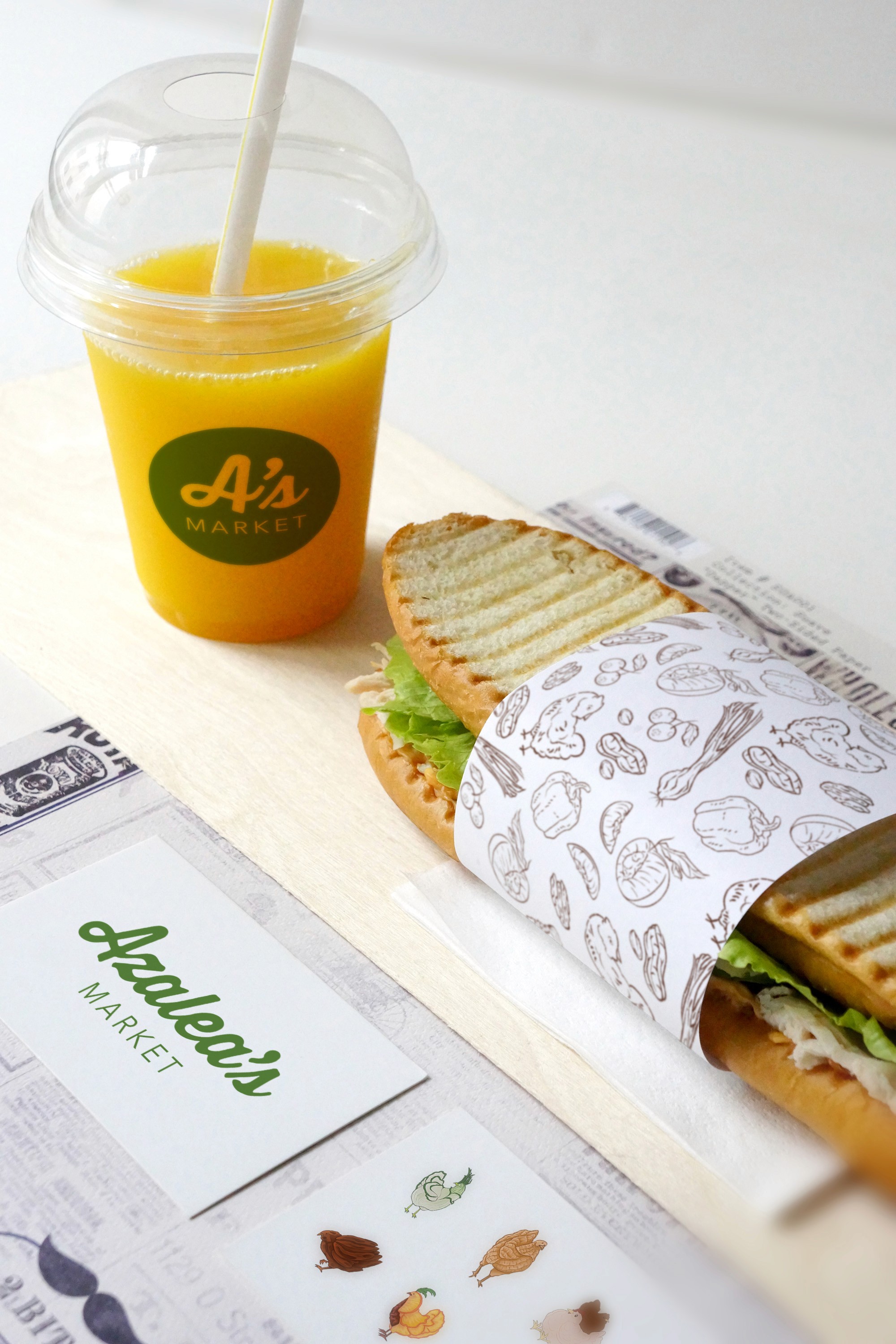
As part of our final presentation to Savi Provisions CEO, Paul Nair, and Atlanta Mayor Andre Dickens, we went above and beyond the mandate of creating the initial brand and designed both a strategy and some initial executions for the grocery stores' products and advertising.

"Rooted In Quality"
Marketing Plan
Who is Azalea?
The decision to personify Azalea with the name Azalea’s was a purposeful one. The personification of the name creates a deeper emotional and personal connection with our target audience. Azalea is not only a symbol of the power this community has from enduring the hardships they have, but she is also a representation and moving forward and uplifting the community.
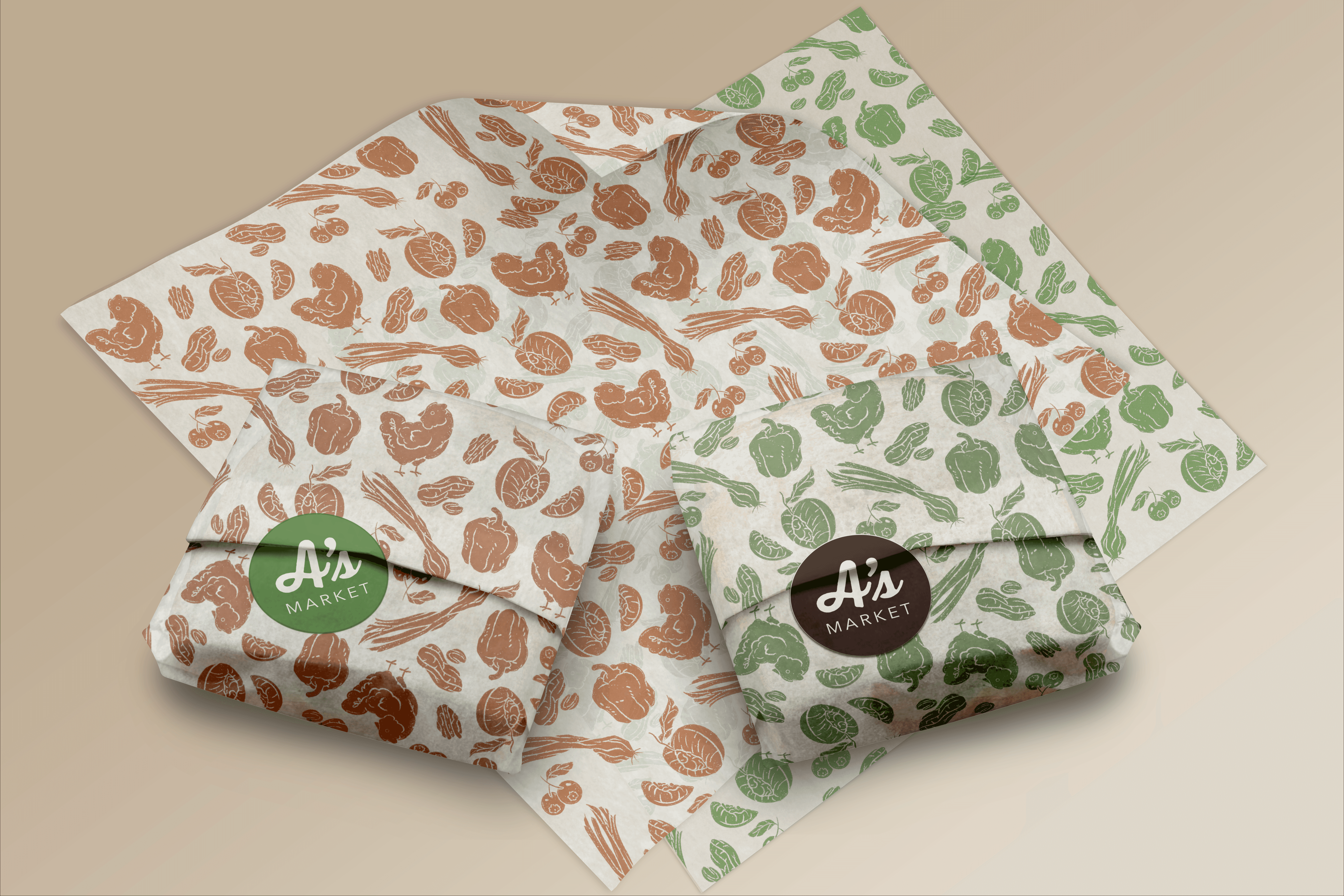
Products
We developed a comprehensive rollout strategy for Azalea’s Market, covering everything from pre-launch buzz to post-opening engagement. Our plan went beyond branding to include community-driven campaigns and strategic touchpoints that positioned the store as a vibrant local hub.


From a UX standpoint, Azalea was designed to feel like a trusted neighbor—familiar, approachable, and inspiring. By personifying the brand, we create a human-centered experience that resonates emotionally and functionally with our community. Every touchpoint—from store layout and signage to digital interfaces and delivery services—is guided by the core idea that Azalea is not just a store, but a companion in daily life. She represents progress, accessibility, and warmth, helping users feel seen, supported, and valued in their journey toward better, fresher living.
"Rooted In Quality"
The decision to personify Azalea with the name Azalea’s was a purposeful one. The personification of the name creates a deeper emotional and personal connection with our target audience. Azalea is not only a symbol of the power this community has from enduring the hardships they have, but she is also a representation and moving forward and uplifting the community.
The decision to personify Azalea with the name Azalea’s was a purposeful one. The personification of the name creates a deeper emotional and personal connection with our target audience. Azalea is not only a symbol of the power this community has from enduring the hardships they have, but she is also a representation and moving forward and uplifting the community.